How It Started
The conception of my first portfolio started once I knew that it was a requirement for job applications. At that time, I did not have many projects and knew very little about design itself. Nevertheless, to not miss out on some of the available opportunities, I decided to put together a portfolio.
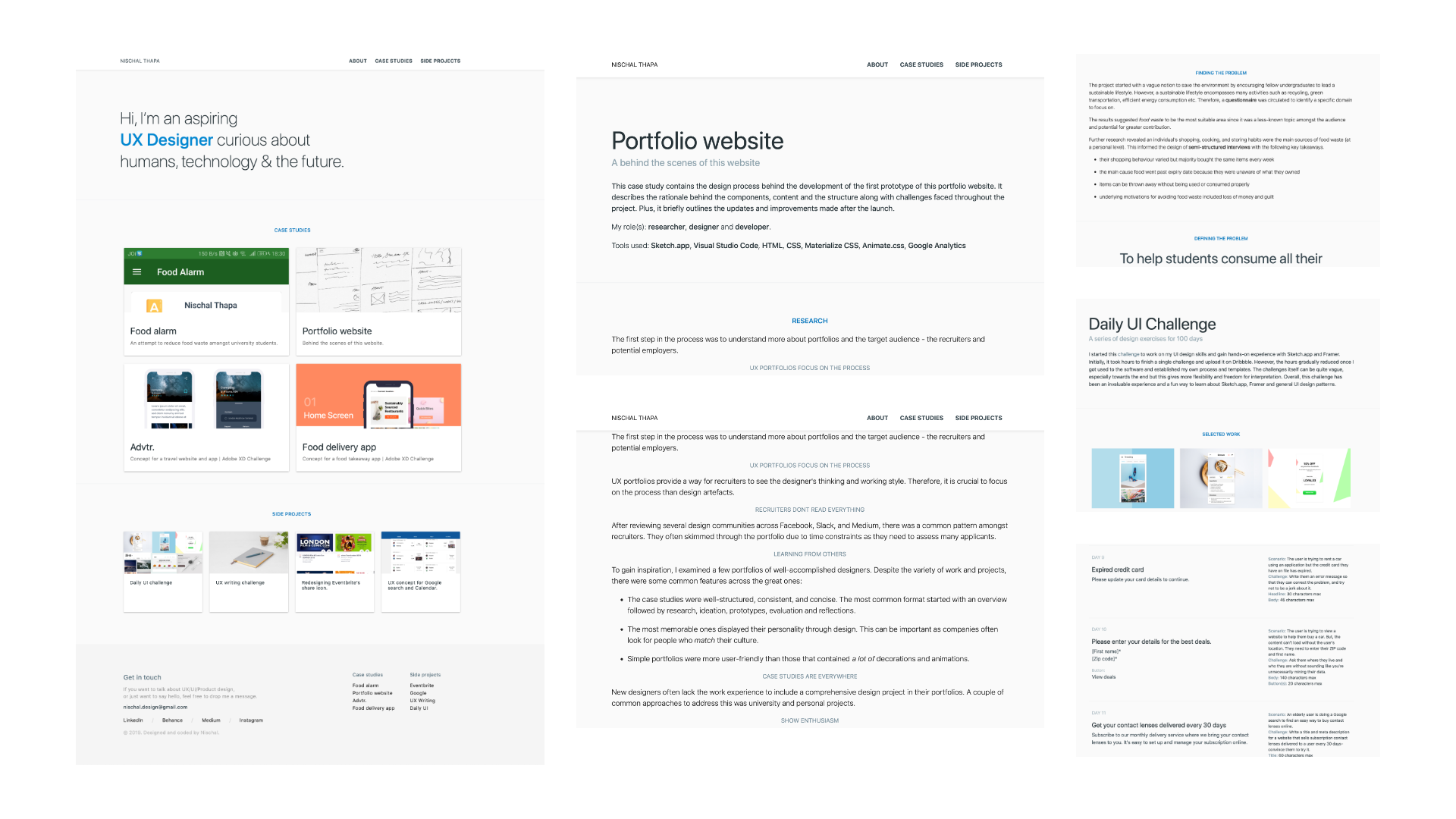
2019. First release
The main focus of this iteration was literally uploading the case study and side projects in a somewhat presentable format.
Initial research on portfolios
Like any design projects, it was important to understand the problem space. Hence, through secondary research via blogs and other portfolios, there were some key takeaways in what goes in a portfolio:
UX portfolios focus on the process
UX portfolios provide a way for recruiters to see the designer's thinking and working style.
Recruiters don't read everything
After reviewing several online design communities, there was a common pattern amongst recruiters of skimming the portfolio.
Show enthusiasm
Specifically for entry-level positions, most job descriptions highlighted enthusiasm and passion for the role.
Ideating & prototyping with a content-first approach
An emphasis was put on the content (i.e. case studies & side projects) over creativity and visual aesthetics while coming up with the design.
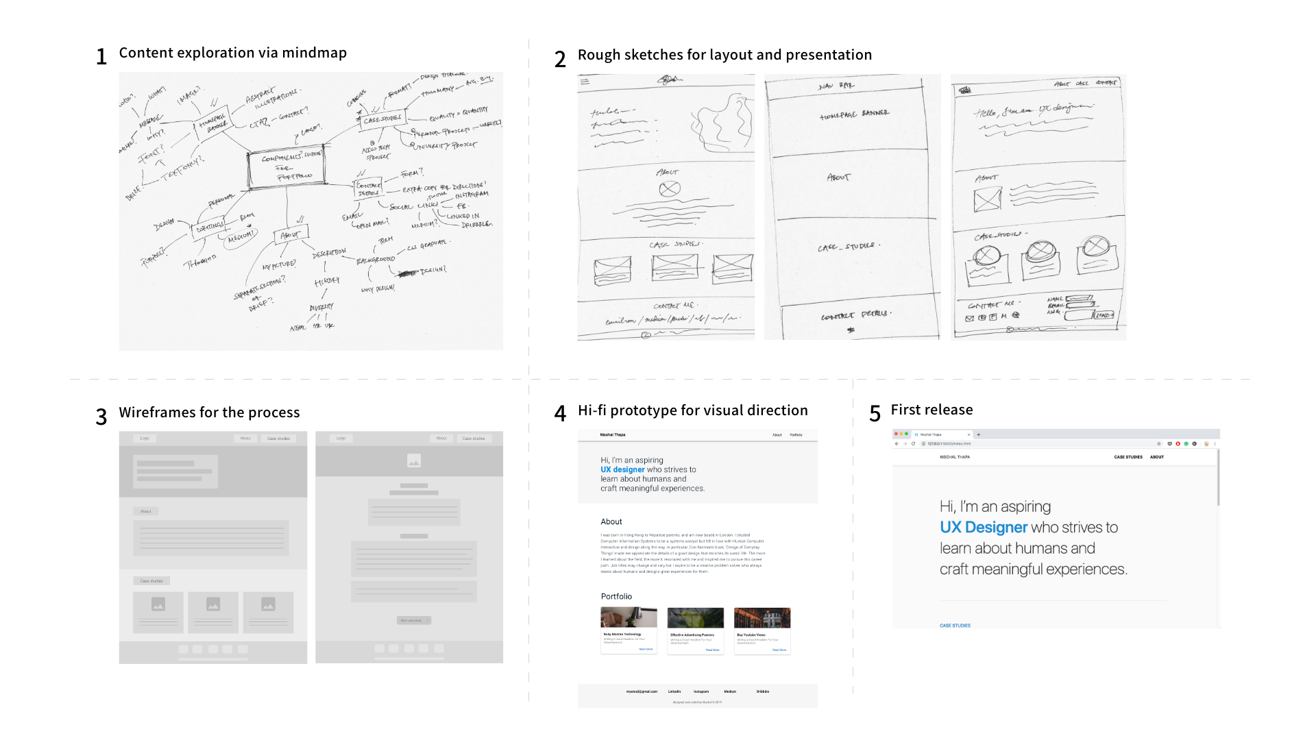
Learning basic HTML, CSS and required frameworks
Although alternatives such as Wix offered speed and ease of implementation, I wanted to gain a basic understanding of front-end development for the future. So, I coded the portfolio myself.
Results & reflections
With further refinements, I was able to secure a few interviews with positive prospects. However, due to a personal injury, I had to stop the job hunt for a while.
In retrospect, this iteration laid the basic foundations for me to improve on. In particular, I was able to understand a bit more about the basics of web development and refine my design process in terms of less perfection and more iteration.
2020. Redesign
The need for a major redesign emerged in mid-2020 while I was reviewing my portfolio for job applications. The old portfolio did not reflect my skills and abilities at that time.
I was disappointed at how cluttered and unappealing it was, especially the lack of negative space and presentation of case studies. So I decided to redesign the whole website, and this time, using a more systematic approach.
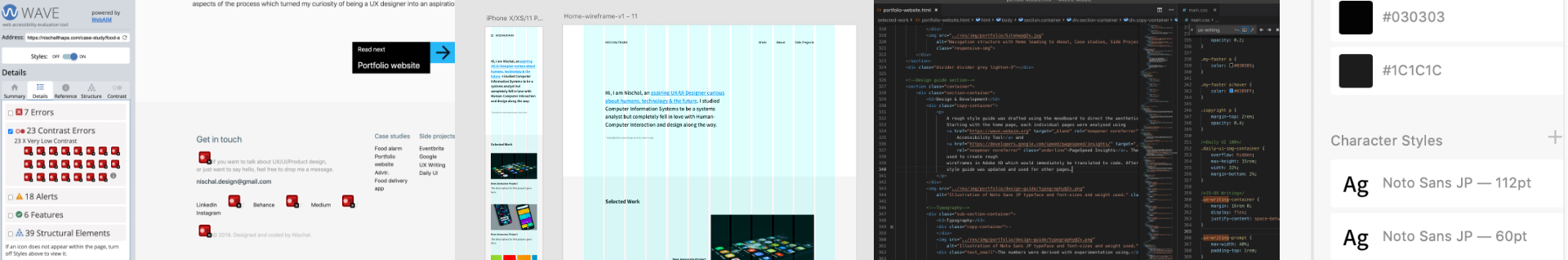
First, using analytics to find problems
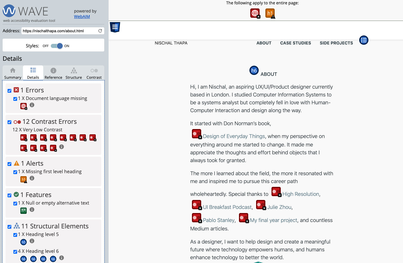
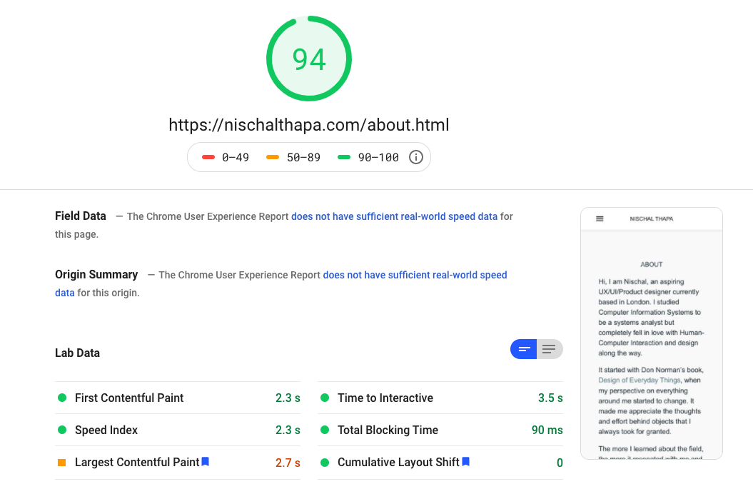
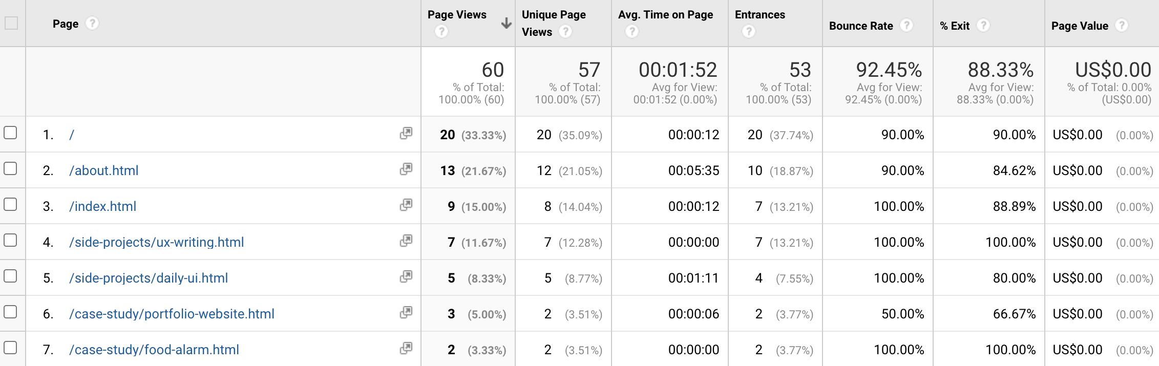
In addition to aesthetics, there were other aspects to refine such as accessibility and performance. Tools including WAVE Accessibility Tool, PageSpeed Insights & Google Analytics implied:
-
Accessibility, mainly contrast and structure of the pages were poor
-
Image quality and sizes needed to scale to improve performance
-
Reiterated the need to change, especially due to poor performance of the case studies pages & drop-off rates at homepage
These findings were then compiled into goals and objectives for the redesign.
Goals & Objectives
-
Refine visual aesthetics
-
Update past content
-
Add new content
-
Improve accessibility
-
Improve site performance, especially case studies
Exploring aesthetics
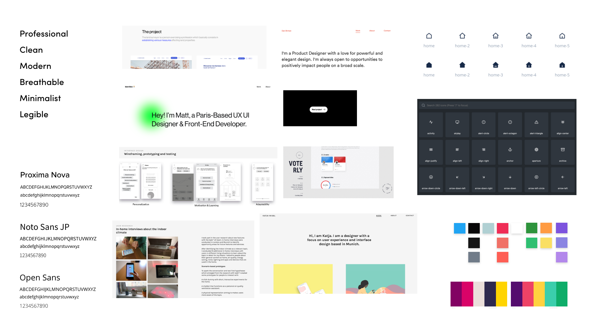
I curated a moodboard to have a rough sketch of the visual design direction. The main emphasis was on simplicity, which would eliminate distraction and also reflect my personal taste for aesthetics.
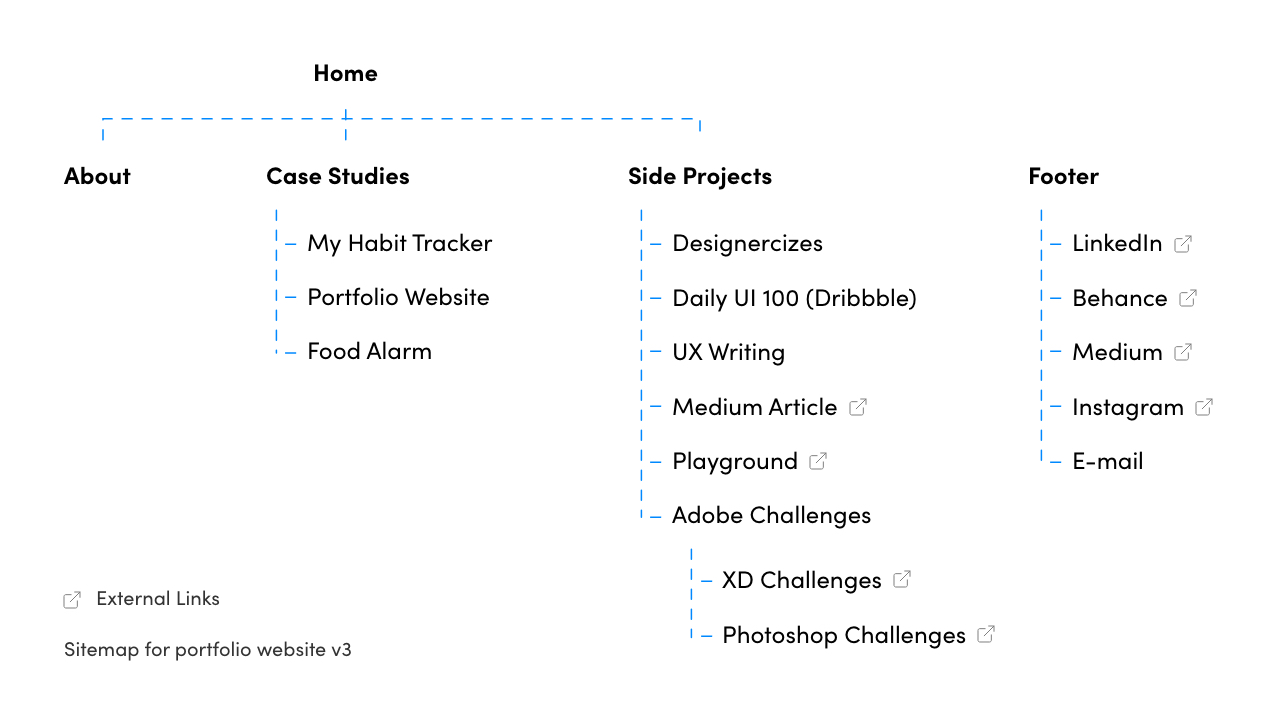
Building structure
Secondly, a sitemap was drafted to organize all the pages, links and create a hierarchy. It was continuously updated throughout the project which resulted in the following sitemap.
Major changes
A rough style guide was drafted using the moodboard to direct the aesthetics. Starting with the home page, each individual pages were analysed using WAVE Accessibility Tool and PageSpeed Insights.
The reports and style guide were used to create rough wireframes and sketches in Adobe XD which would then be translated to code. After completing a page, the style guide was updated and reused.
The following section provides a brief overview of the major changes.
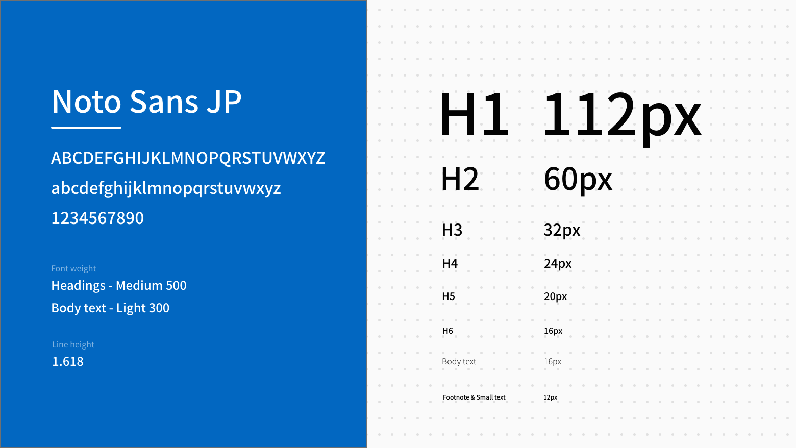
Typography
Noto Sans JP was ultimately chosen for its variety of font weights and appearance while offering legibility and readability. A base font size of 16px was used to create the size weight for headings and line spacing.
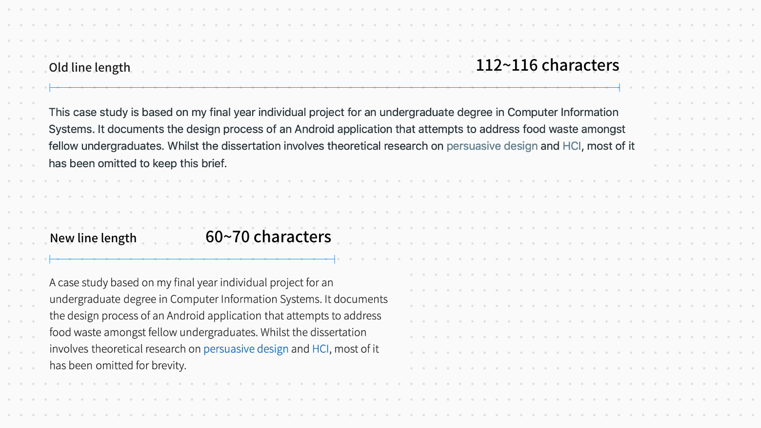
Adjusting the line length
Line length was another aspect the previous design lacked of. Hence, these were greatly reduced to the recommended number of characters.
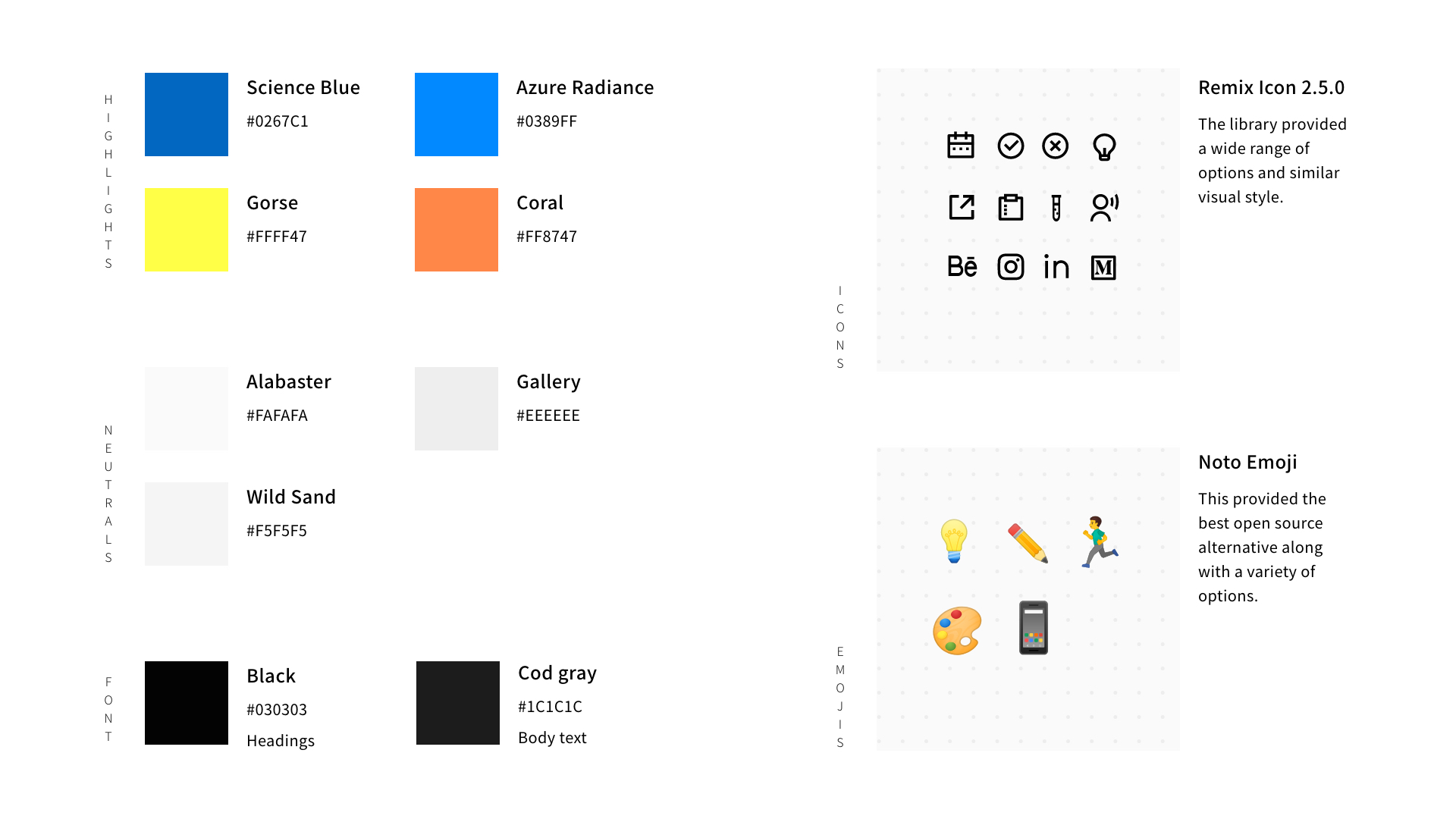
Colours, Icons & Emojis
Colours are used sparingly with the sole purpose of highlighting special states, components and sections.
Icons (Remix Icon / Apache License 2.0) and emojis (Noto Emoji / Apache License 2.0) were implemented to give a bit of character.
Components
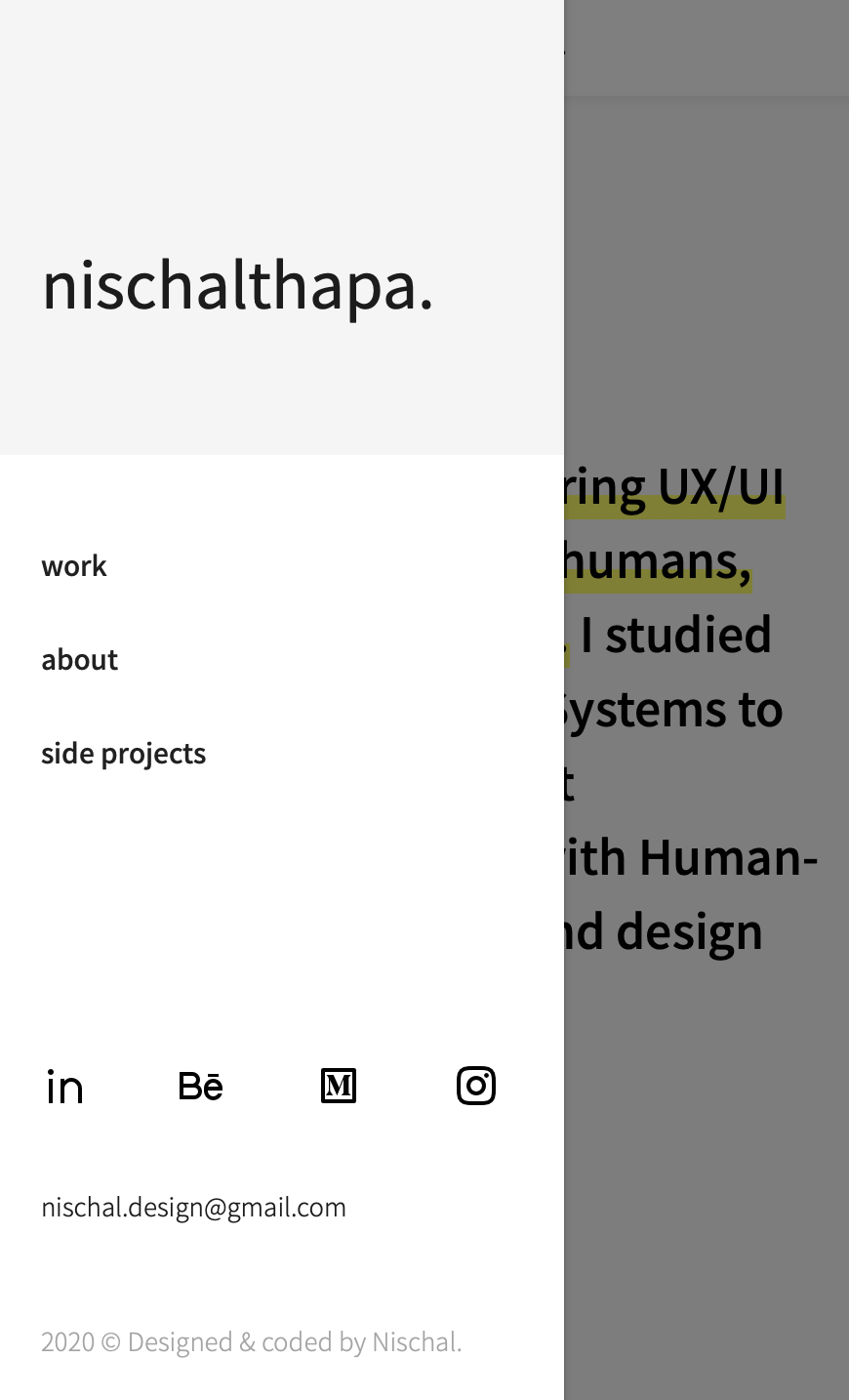
More friendly top navigation
Although the previous design's bold navigation links were useful in some cases, it did not suit the appearance of my current portfolio.


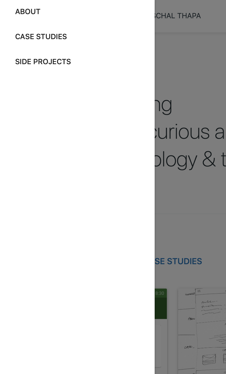
More useful side navigation
The previous version embodied minimalism a bit too much. So, I decided to add a bit more functionality in it.
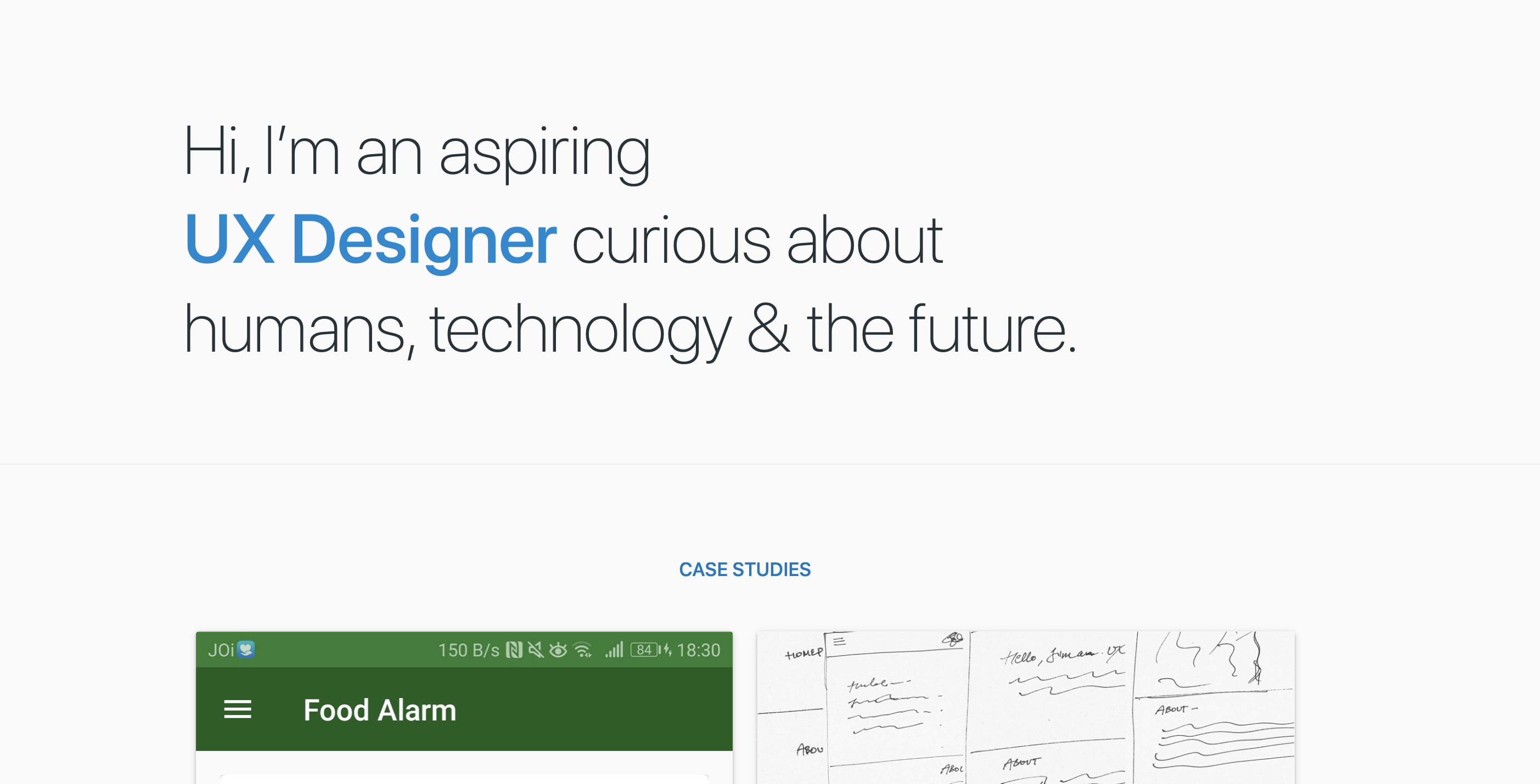
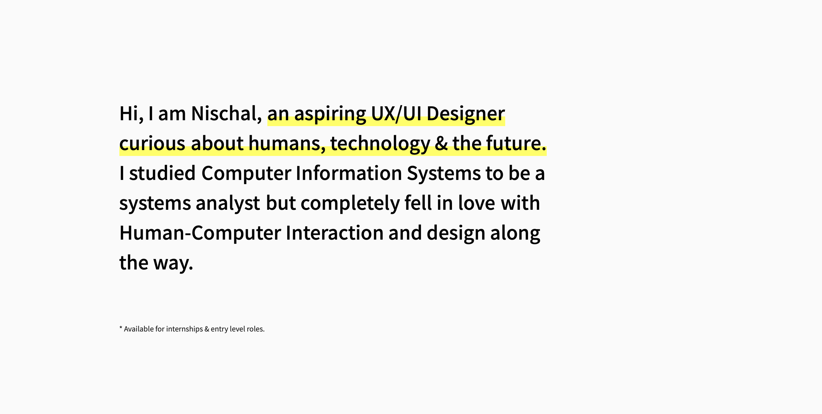
More informative hero section
A short self-introduction and my current status is relatively more useful & informative than the previous iteration.
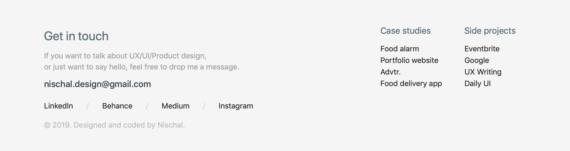
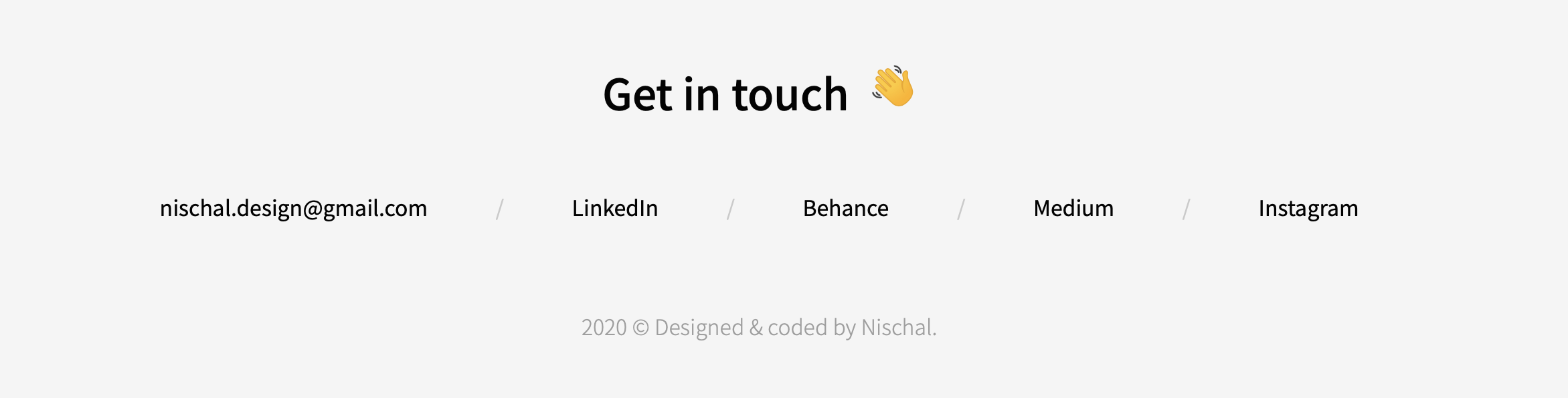
More compact footer
With increasing numbers of pages, the footer was bound to be more complicated. Hence, I repurposed the footer for contact purposes only which is more suitable in the case of a portfolio.
Feedback
To gather opinions on the redesign, I did a quick informal feedback session, where I showed both of my designs and asked them for their opinions.
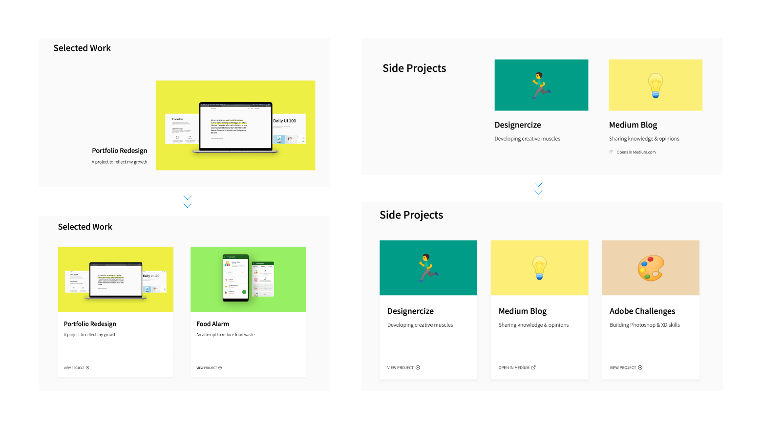
The general consensus showed to prefer the card design and project layout in the homepage of the previous version, and the navigation and hero section of the new design.
Outcome
Overall, all goals and objectives were accomplished for the redesign. In terms of site performance, it will be reviewed in the future once enough real world data is collected.
-
Refined visual aesthetics with a cleaner interface
-
Updated past content with focus on presentation and layout
-
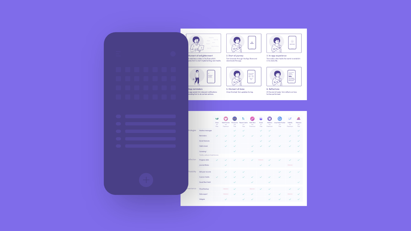
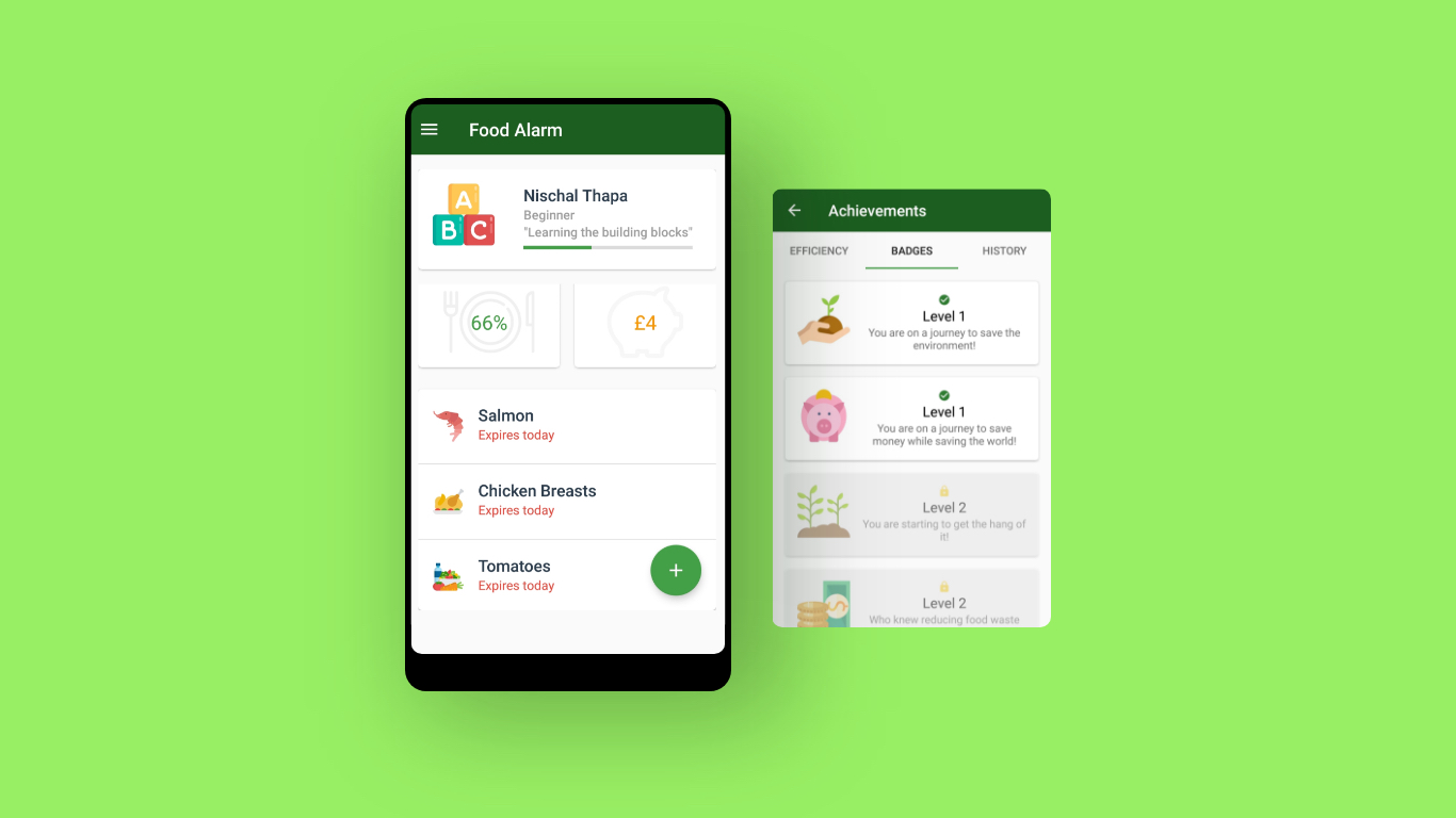
Introduced new case studies and side projects
-
Reduced the total amount of accessibility errors from 197 to 0
-
Improve site performance, especially case studies (pending)
Progress reflection
This redesign project has been extremely helpful in many ways. Not only has it improved my design skills and process, but it has also allowed me to reflect on my progress since I first started. Throughout the redesign, I was able to constantly be more intentional about my design choices, which was almost non-existent in the first iteration.
2021. Currently...
The portfolio is frequently updated with new suggestions from recruiters, fellow designers and personal reviews. The most recent update addressed the flow and content of individual case studies, which seemed to be lacking according to a recent feedback session.
Plan for future updates includes a new case study, reorganisation of existing side projects, and more details on about me page.